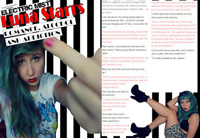
this is my double page feature for my magazine. i created this page again on Microsoft Publisher, with some uses of photoshop in the process of editing images.
Photoshop
in the process of creating my double page i used photohop to edit image for this page. To remove the background of the smaller image i used the 'Lasso' tool which enabled me to draw round the image and delete the background. firstly i drew round the area of the background that i wished to delete, this was then selected, then to remove the selected area i clicked 'delete'. This then left the background white. Another tool i used in this process of image editing was the 'Magic Wand tool'. With this tool i clicked on an area of the background i wanted to get rid of, this then cut out round the main image which i wanted to keep, then pressed delete to remove it. although this was a useful tool, it sometimes selected parts of the image that i wanted to keep. After this i used the eraser tool which let me get rid of any small parts of the background that hadn't been picked up the my 'Magic Wand Tool'.
Microsoft Publisher
in the making of this double page i used Microsoft Publisher. i chose this program as it found it easy to work with and it was quicker and more effective way of creating my double page. Using Publisher aslo allowed me to get rid of the white backgrounds on my images quickly. I did this by using the 'set transparent colour' tool which is found in the 're-colour' section of formatting. this meant that i could place images or text in front or behind and you can still see that parts that arent coverted by the main image. it was easy for me to add columns into the page as i just used a text box and reshaped it into the shape of a column, then i added the text and changed the colour of the questions and answers so it was clear to the reader which was which. To create the striped background i used the 'shape' toold and drew a square and elongated it to make the stripe then 'sent to back' so that i could put image over the top of them.
Use of Images
On this double page i used two images, a main image on the left hand side of the page and then a sub image on the right hand side of the page. the main image i used to try and create a negative representation of this person, which i hope will be contrasted when the audience read the text. in the text i attempt to make the artist come across as a genuine and down to earth to hopefully change the audiences perceptions of this person. in the main image i hope that the audience will see the person as someone who may be controversial and someone who receives bad press in the media. the fact that the subject in the image is sticking their finger up in the main image is supposed to be a subliminal image to the people who she get 'hate' from. The sub-image is supposed to come across to the audience as inviting and also showing another side to the artist that is contrasted with the main image and in some senses inviting the audience into parts of her life that the audience may not know about. The target audience for this magazine is people aged 16-35, for this pagei imagine that the target audience will be mainly males as they may find the sub image appealing. The secondary audience for my magazine is females aged 16-35, who may see the image and aspire to be like her.
Use of Text & Colour
The colour use in this page is the same colour pallet that i have used in the front cover, the main colours being Black, White and Red. i chose to use the same colour to give the magazine a house style so tha the pages flow into each other well rather than having completely different colour schemes within each page. The text that says 'luna starrs' is written in red, the colour red has two contrasting meanings, love and danger. i intended for the red text to stand for 'danger' as people will think 'luna starrs' is dangerous which will be contrasted with within the text where i project the image of her as a down to earth young woman who has alot of problems in her life which makes her the way she is.

No comments:
Post a Comment